


Collaboration
Unlike theatre, your audience may know more about the data than you do. It’s like performing to a group that already read the book. Their “tribal knowledge” or “experienced intuition” has to be pieced together to obtain the true picture of the data. There is character development that is essential to cleaning and transforming the raw values. It's smart to meet with the stakeholders closest to the business process. During these meetings, don’t make any assumptions about the data. Showing the team the data and asking for feedback is an essential part of the process.
What does that look like in application? Let's say we share a map of customer density by state. The business may point out that customers had been self-reporting this information and entering the first location in the dropdown instead of reporting their actual location. This isn’t something we could have known from reviewing the data and so with that valuable insight we may decide to join an additional data source to bring in this information.
Documentation
When you walk into the theater you’re usually handed a playbill so the audience knows who is performing. The first question that often comes up when showing a visualization is where the data comes from. When preparing a dashboard for a meeting, it's a good idea to describe:
- Data source(s)
- Filtering and cleaning
- New column definitions (especially those created with formulas)
Additionally, on each visualization it's a good practice to add labels, titles, and a detailed legend. There may even be a note to add of something peculiar or interesting and an opportunity to get feedback from the audience. These cues help track details to review later.
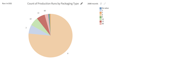
For example, the following visual doesn’t provide any measurement for total on the axis or in the title. The date is ambiguous. Is this describing the run date? Order date? Ship date? Invoice date? Requested delivery date?